
Guide to Understanding the UltraPress Proof
UltraPress will print your order to the specs outlined on your proof. This article is a good guide on breaking down all the various parts of the proof.
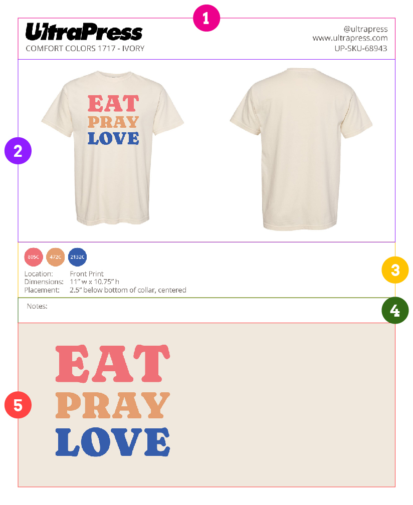
Top Section / Header: this contains two very important pieces of info. First, on the left hand side you will see the brand, style and color of your garment. Please make sure this matches with what you are ordering/approving. On the right hand side there is a 5 digit code (behind UP-SP). This code is the artwork / design ID. This is handy when contacting us or when you'd like to reference a previously printed design to reorder.
Mock Up: the image of your design laid on top of the garment is called the Mock Up. It is a good visual representation of how your design will look on the garment.
How We Center Designs
For front and back prints where the design is centered on the shirt (Placement contains "centered"), we will always center the left and right most point of your design to the physical garment. However, your actual design asset being balanced vs unbalanced will determine how the centering will visually look when its printed.
Balanced Design - Centered
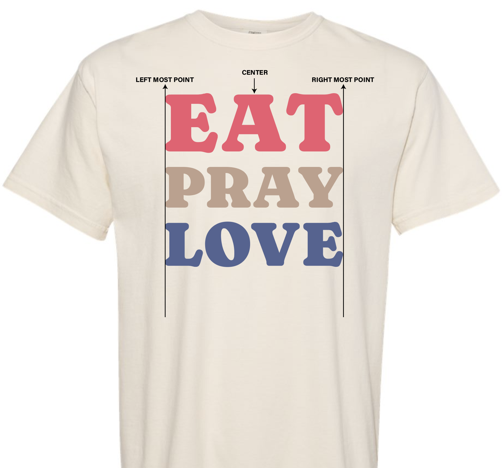
Most designs we receive are "balanced" and when printed, will look visually centered to the shirt. No disclaimers/warnings will be added to the proof.
In these cases, in the rare case your design looks slightly off centered on the mockup, it is mainly due to the blank garment image we receive from the manufacturer being poorly cropped and/or 3D effects of garment folds and lighting. We will make every effort to print your design centered on the physical shirts.
Unbalanced Design - Centered
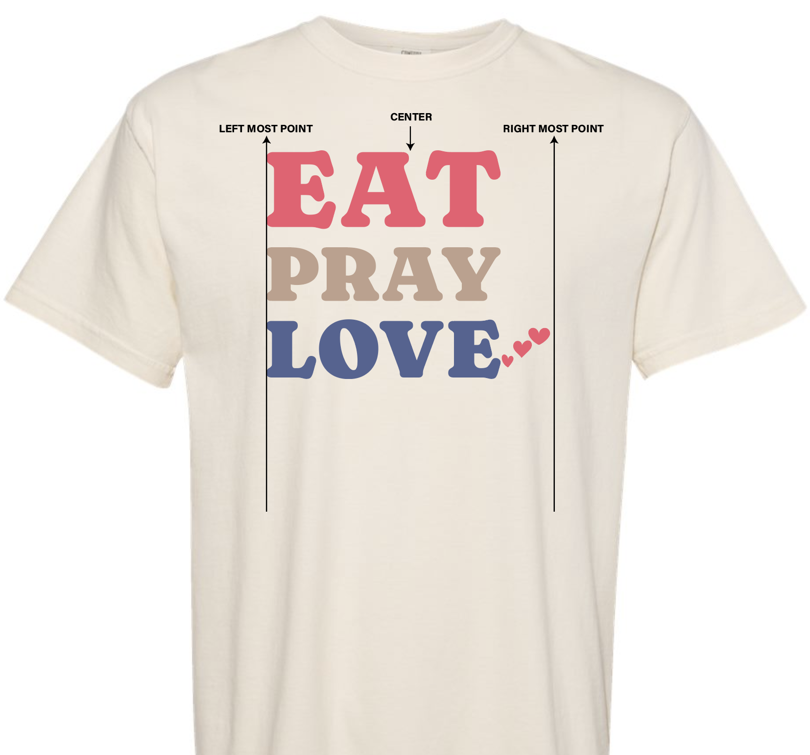
If you submit an "unbalanced design", we will still center it in the same method on your proof mockup - the left and right most point of the design. The example above is still considered centered.
We WILL NOT manually adjust the design to appear more visually centered, as this is subjective. Your proof will contain a disclaimer/warning in the Notes section of the proof.
In these cases, if you'd like your design to appear more visually centered, you may issue a revision with a new design asset, or ask us to edit specific aspects of your design (for example, removing the hearts on the right side).
Ink Colors and Print Specs: this section is very important as it contains the actual specs of where and how your design will be printed on the shirt.
Ink ColorsIn this section you will see circular swatches that are filled in with colors and with a code written inside the circle. These are ink swatches and represent the ink color(s) that make up your design. Each ink swatch (with the exception of black and white) also has a color code called a Pantone code. Pantone codes are codes that identify a specific color. We will select the ink colors to print according to these ink swatches. Please note there is a high likelihood your logo or design color may look slightly different than the ink swatches here. There are a number of reasons for the difference but the two most common reasons are 1.) differences in how colors are displayed from screen to screen (for example phone to laptop) and 2.) we only use a house list of approximately 100 Pantone colors. Chances are we may have tried to find the closest ink color that your logo matches with our house ink list. For more info on ink colors and to view a list of ink colors that we use please see this article: https://ultrapress.frontkb.com/en/articles/1111616
Print Specs
In this section we list out the location, dimension, and placement of your design. For the placement, the distance that we list (i.e. 2.5" below bottom of collar) means the distance between the lowest point of the collar to the top of your design is 2.5". We will print according to these print specs on all of the garments in your order.
Notes / Disclaimers: any special notes or disclaimers regarding your design or proof will appear here and should be paid extra close attention. When you are approving your proof you are also approving / noting all disclaimers on the proof.
Close Up: this section is where we present your design as large as possible so you can review all the details of the design. This close up is also a good place to review any spelling if your design contains a lot of text.
Finally, please note all care and attention will be paid to ensure we print your order to the specs on your proof. However, screenprinting is not an exact science. Please review our article on print disclaimers: https://ultrapress.frontkb.com/en/articles/1111808